The PAYNEful Portfolio – Redeveloping PAYNEful.co.uk (or How I Got CodeIgniter and WordPress to Play Nice Together)
Like anyone who works with the web, I get restless sometimes and occasionally get a fleeting notion that I need to overhaul and redesign my website. In this case PAYNEful was on its first version, if you disregard the placeholder page that sat on the domain for the best part of two years. It served its purpose, but like any project you have to weigh up the pros and cons, and then set some goals if you do decide to redevelop a site.
Why Redesign?
For reference, here are some images of the 1.0 version of the site (click for full image):
The old site was great to work with back when I first developed it – it was a small collection of fairly static PHP pages that were never intended to change frequently. However, after more and more pages have been added it became fairly cumbersome to work with the site – if I wanted to update the footer, for example, I had to open up every page and edit them. The header and navigation was not such of an issue as I long ago got naffed off and stuck it all in an include file. In the majority of cases if I wanted to roll out changes to my website I had to do so manually.
Another problem was the sheer amount of content to display – not to blow my own trumpet but there’s an awful lot of stuff living on this website! The front page was a bit of a nightmare, given that the top half was dominated by the most recent stuff and all the other projects were shoved down at the bottom. I wanted more “above the fold” and, more importantly, less text and more graphics!
Thirdly, there was the issue that I’m not running one, not two, but three separate WordPress installations! This sounds like overkill, but the Blogsplosion is my personal blog, Tales of Sin deserves its own area and my “Work and Portfolio” blog content really does need to be separate as the things that get posted to it are very different from the kind of thing I post to the personal blog; I like the distinction between “work” and “pleasure”. Unfortunately, like the other duplication issue, this meant there were two WordPress themes1 that required updating whenever I changed the website! I am happy with the concept of managing three separate blogs, however – for the most part WordPress updates itself and it would just be too much hassle to develop my own blogging CMS.
Fourthly, I’m the kind of person who gets annoyed when I’ve overlooked something. I don’t use my mobile phone to browse the web, but I recognised that there is a growing shift to mobile browsing. As a web developer, I would be ignorant to dismiss mobile; I admit that my website looked bloody awful on phones, and the scrolling was unbearable. My website needed to be responsive!
Finally, I really needed to get rid of those Sonic the Hedgehog 16-bit backgrounds (all pinched from the Spriter’s Resource); as much as I liked them were are a bit naff and potentially copyright infringing as far as SEGA is concerned!
So what were the requirements of this revamp?
- Make page management easier – it shouldn’t be a chore to update the site.
- WordPress themes need to take their styles from whatever styles are dictated to the rest of the website.
- Try and make the pages more pleasing on the eye – less text, more eye candy!
- Web pages to be mobile responsive.
- Get rid of those bloody sprite backgrounds!
How Can We Achieve This?
The next step was deciding how to achieve these goals, and that all comes down to what technology to use. The first obvious bit of kit was Bootstrap (ver. 3), which I must say I am very impressed with. It takes all the effort out of setting up a HTML scaffold, comes with a whole bunch of useful CSS classes out of the box and, most importantly, has mobile responsiveness built in! I’ll admit, my knowledge of CSS media queries is sketchy at best, but Bootstrap bypasses the need to even touch the “@” key when putting together a CSS file.
The alternative to Bootstrap, in my mind, is jQuery Mobile. I have used jQuery Mobile and it is very useful, assuming you want to create a web app that looks like a phone app (like you would get on a smartphone, the iPhone in particular). However there’s a lot of bloat that comes with it, in particular the whole “page” system where duplication of code becomes a problem – one HTML page in jQuery Mobile can contain multiple pages that it loads using AJAX, which means it fetches the HTML content for a page and displays it in the current view2. jQuery Mobile only really comes into its own if you are approaching a project with the mindset of keeping desktop and mobile browsing very separate. Bootstrap comes in on top when you want the site’s aesthetic to remain the same across devices.
I also wanted to use CodeIgniter, an MVC framework that is often maligned but it serves a purpose3. It’s the one that (at the time of writing) I am most familiar with and I wanted to implement it as the basis of my website as it would mean that creating a new static page would just be a case of creating a new function and loading in a bunch of existing views. The fiddly part would be getting it to work alongside the existing WordPress blogs, but more on that in a bit…
The Design Process
I began by just playing with Bootstrap, placing brightly coloured boxes to represent bits of content4. It was a good exercise as Bootstrap helps promote “mobile-first” development and it became apparent very quickly that certain things on a full webpage wouldn’t work on the mobile. This actually led to the web pages moving from a two column layout (something apparently ingrained in my head) to a three column layout. The sidebar on the desktop view, which contained the “welcome” box and latest tweets doubled as the first content that would be served up on the mobile version, and so on.
You can see images of the design process below (click thumbnails to see a full size version):
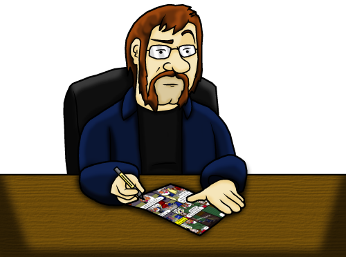
After a little bit of playing until I found a format I was happy with, there was still the matter of the site looking very text-heavy. I resorted to randomly setting a background image of various of my projects, pets and comics which lended a nice blast of colour to the page. A caricature of me in the top left (an idea nicked from LordLikely.com) gave a bit of personality to the header and I finally got rid of the inconsistent social media icons grabbed from Google image search and replaced them with some sprite-art icons5.

The main static pages were fairly straightforward to translate into the new Bootstrap structure, and using CodeIgniter meant that all I had to do was build partial views and let the framework do all the hard work of assembling full views. Existing PHP code I had already written to grab Twitter posts and WordPress feeds slotted nicely into CodeIgniter functions. Even the WordPress themes were fairly easy to convert, with a little help from this article. I even managed to put together an RSS feed that amalgamates all my WordPress feeds and my Twitter feed into one place!
WordPress and CodeIgniter – Making Them Play Nice Together
The trickiest part of the entire redesign was getting WordPress and CodeIgniter to play together nicely. The two are entirely different systems with different purposes – the former is a blogging platform intended for “standalone” installation (although you can install it to a subdirectory and skin it to look like the rest of a static site) and CodeIgniter is an all-purpose framework for developing full-blown applications. There were several options:
- Scrap WordPress altogether and build a blog platform within the framework. This was not an option due to the sheer amount of existing content to work with, and I didn’t fancy tangling with the web of WordPress tables. Besides, why reinvent the wheel? I don’t like the scrappy workings behind WP but as a blogging tool it is all-purpose and lets you get on with writing stuff. It’s a quick and dirty solution that works.
- Integrate WordPress into CodeIgniter functions. I have read about this on various posts around the web, and from what I understand you basically install WordPress to a subdirectory and then call its various functions as part of a CodeIgniter class. It sounds like an absolute mess, and I don’t want to even consider the security implications. The worst part is that there would basically be a redundant WordPress install that CodeIgniter would be leeching off of.
- Keep WordPress and CodeIgniter as separate as possible, but only join them at a presentational level.
I opted for the last option. CodeIgniter is pretty happy to allow you to create and fill directories without assuming that the URL paths are part of its RESTful architecture. If you want CI to handle the Index page at /site/somepage but you have a bunch of static pages at /site/somepage/static, it won’t treat the last part of the URI as a parameter for somepage; it will just allow the static pages to be served up instead. Similarly, if you install WordPress to a subdirectory CI won’t bat an eyelid – WordPress will be left to its own devices to manage its URL structures how it likes; you might just need another .htaccess entry for the WordPress URLs.
The only bits that need to be shared between CI and WP were views, specifically the header, the footer and maybe a sidebar or two. Part of the purpose of the redesign was to make it easier to update the whole site, and if I cheaped out by just skinning WP to match then in the long run it negates the point in the first place – you can spend hours skipping between subfolders and copy/pasting between stylesheets to get a WordPress installation to match the rest of a site. If I update the header, I want it to apply to the entire site!
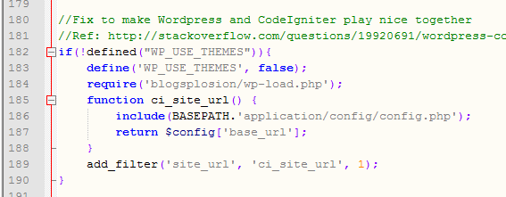
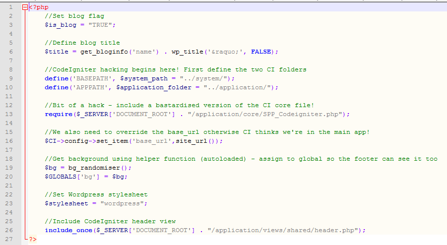
I had already added WordPress’ functions to CI by loading them within CI’s index file6. However, the tricky bit was loading a CI view file into WordPress – there are a lot of CI-specific functions calls made which would just error as WordPress does not have access to CI functions.

I spent the best part of a fevered night coding attempting to include specific CI files into the header of my WordPress theme, with intentions to then invoke $this->load->view. No matter which CI files I included, it would throw up a white screen of death declaring that something hadn’t been set correctly or that a file was missing. I was going to declare it a lost cause when, around two in the morning, I thought to myself “I don’t want to modify the core files of CI. If only I could make a copy of the files that I can play around with as much as I like“. This was promptly followed by a second thought that declared “you can do that, you dingus!“.
You can extend practically any part of CodeIgniter that you like, by creating a file in /application/core. I literally copy/pasted the core file, renamed it and got to stripping out the non-essential bits. I’ll admit this was a bit trial-and-error as I don’t usually tinker with the CI core, but in the end I had a core file that enabled WordPress to use basic class functionality in loading views and CI functions. I can’t wholly endorse this practice as I’m sure I have probably overlooked some security implication or other and there’s the small matter of having to update the “bastardised” core file every time you want to update CodeIgniter.

Simplifying WordPress Updates
So now I had two WordPress blogs loading most of their content from CodeIgniter. Another idea struck – could I reduce the duplication by pointing all the include references for one blog to the other blog (e.g. header, footer, sidebar, etc.)? It turns out that the answer is yes! This meant that I would only ever have to update the one theme now, and the other blog would just leech off of this blog’s theme.

To increase security7 and assist with the management of the WordPress installations, I installed Wordfence and InfiniteWP – the former to keep an eye on blog logins and potential hacks, the latter to manage updating all three blogs without having to log in individually. InfiniteWP really is a godsend as it can also do full blog backups at a button click too.
The Result

The result of my endeavours is the following:
- A website that is a lot easier to manage when updating pages or elements across the whole website.
- Easy WordPress updates.
- CodeIgniter functionality, which opens the door for creating future projects (like, say, a bookmark sorter or YouTube feed aggregator) without having to prep a new framework or core functionality each time.
- A site that looks a lot more graphically pleasing – I admit that I’m no expert designer but this design at least show off my more artistic side!
- The site now displays nicely on mobile devices.
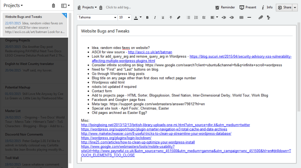
There is always room for improvement, and I doubt the site will ever be “finished”. I have a to-do list of bugs and tweaks that never seems to shrink in size and I always have new ideas about things I want to do. The main thing is that I now have a solid foundation on which to create things, which is all I ever wanted really!

Postscript (30/11/17)
It turns out that managing two separate blogs is a massive pain in the backside so I’ve caved and merged all the portfolio articles into the blogsplosion, just in case you read this and wondered what I was talking about in regards to a “portfolio blog” when this article is clearly on the blogsplosion.
Past me just liked to overcomplicate things.
- Tales of Sin has a standalone theme intentionally meant to look different from the rest of the site and evoke more “sci-fi”. ↩
- The fact everything is loaded with AJAX is key to using jQuery Mobile – I once spent the best part of a day trying to fathom why mobile pages weren’t loading correctly, only to realise it was because jQuery Mobile was trying to fetch the content of separate HTML files to present using AJAX. Big, heavy pages with PHP elements and their own javascript were being served up as plain HTML. If you want a link to behave normally in jQuery Mobile, you have to specifically label it as a “regular”, non-AJAX link with “data-ajax=false”! ↩
- It’s funny how searching for articles on whether CI is any good will often find results where bloggers tear into its many flaws, only to conclude with “it’s solid and stable, you should use it if you wish as it’s actually not all that bad”. ↩
- I absolutely despise how “content” is now the de-facto word to represent consumable media. YouTubers, games developers and television people now describe everything as “content”, a cynically cold word to describe “stuff that isn’t advertisements where the money is made”. Content, in web design terms, means the stuff that isn’t design, the juicy text and images that are contained by the website. ↩
- The art of creating miniature sprites is a hobby I don’t get to indulge much any more since I packed in playing with MUGEN and helping with video game projects. ↩
- There’s one conflict as, sod’s law has it, there’s one function name that appears in CodeIgniter and WordPress. There’s a fix where you can redefine the name of the CI function in the index.php file so it will no longer conflict. ↩
- I have other plugins and various .htaccess measures to help guard against hackers, but you can never be too careful – WordPress is a prime target for hacking due to its popularity. ↩
Post by Sean Patrick Payne+ | August 1, 2015 at 10:00 am | Portfolio and Work, Projects, Projects, Technology | No comment
Tags: Bootstrap, CodeIgniter, CSS, HTML, jQuery Mobile, PHP, Please don't hate me for my horrible code, WordPress

